User Manual
Overview
Hereafter is given an overview of the GCP Viewer platform.
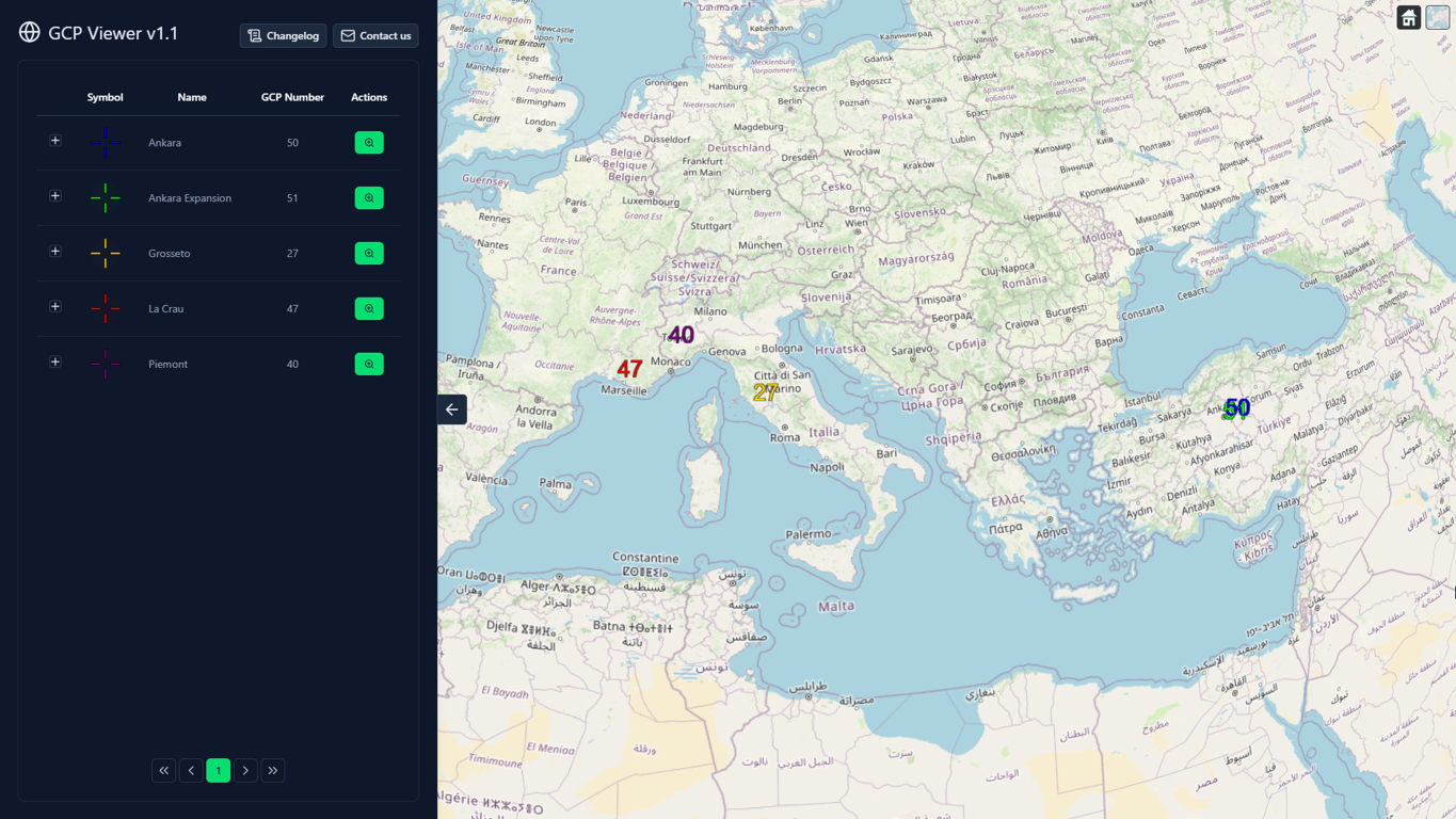
As seen in the figure above, the GCP Viewer is composed of a 3D globe (right) and a main panel (left). The functionalities offered by both of these features are discussed in next sections.
3D globe
This section gives the main user interactions and functionalities of the 3D globe. Individual functions of the globe are given in the following subsections.
Navigation
| Action | Value |
|---|---|
| Left click + drag | Rotate the globe (panning) |
| Right click + drag / Wheel scroll | Zoom in/out from click coordinate |
| Wheel click + drag | Tilt the view |
As seen in this table, users may browse the globe and control the camera only using the mouse clicks and wheel.
“Home” button
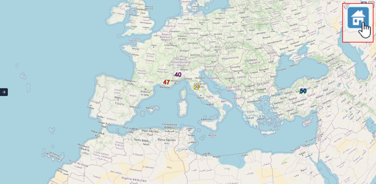
At any moment, the globe can be set to the default view using the “Home” button. The figure above illustrates the default view, set by clicking on the “Home” button on the top-right of the screen.
GCPs and clusters
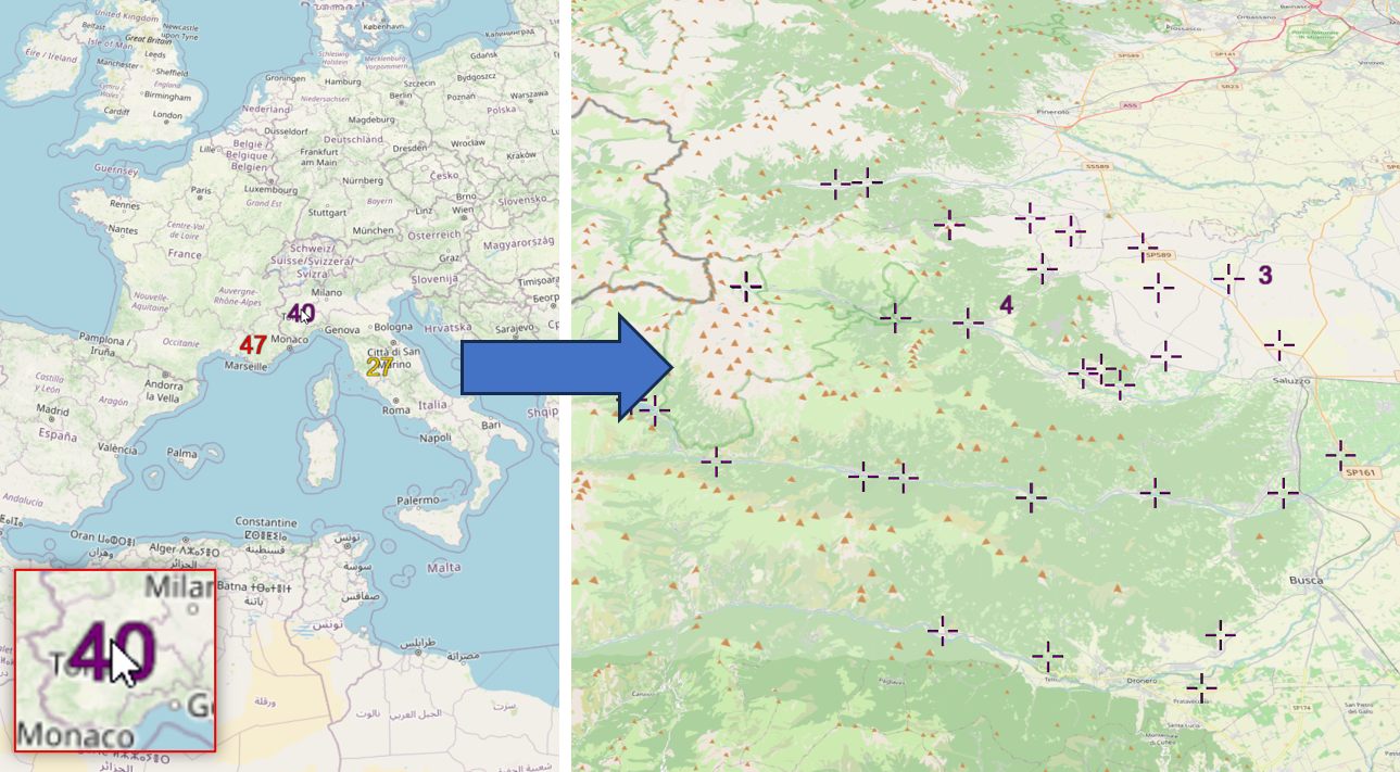
On the globe, clusters of GCPs are represented by coloured numbers. GCPs are only clustered if they belong to the same collection. Clusters inherit their colour from their collection symbol. As illustrated in figure above, clicking on a cluster allows to zoom on its GCPs.
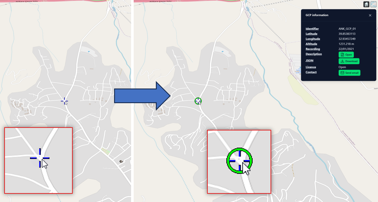
An individual GCP may be selected by clicking on it. As illustrated in figure above, the selected GCP is circled in green. The selected GCP information is given in a separate window, located in the top-right of the screen.
GCP information
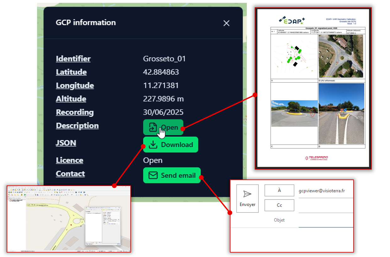
Information about the selected GCP is given in a dedicated window on the top-right of the screen. As seen in figure, this window contains the main characteristics of the GCP, as well as action buttons allowing to open the description document, download the GCP as JSON and contact the maintainer of this GCP.
Base map picker
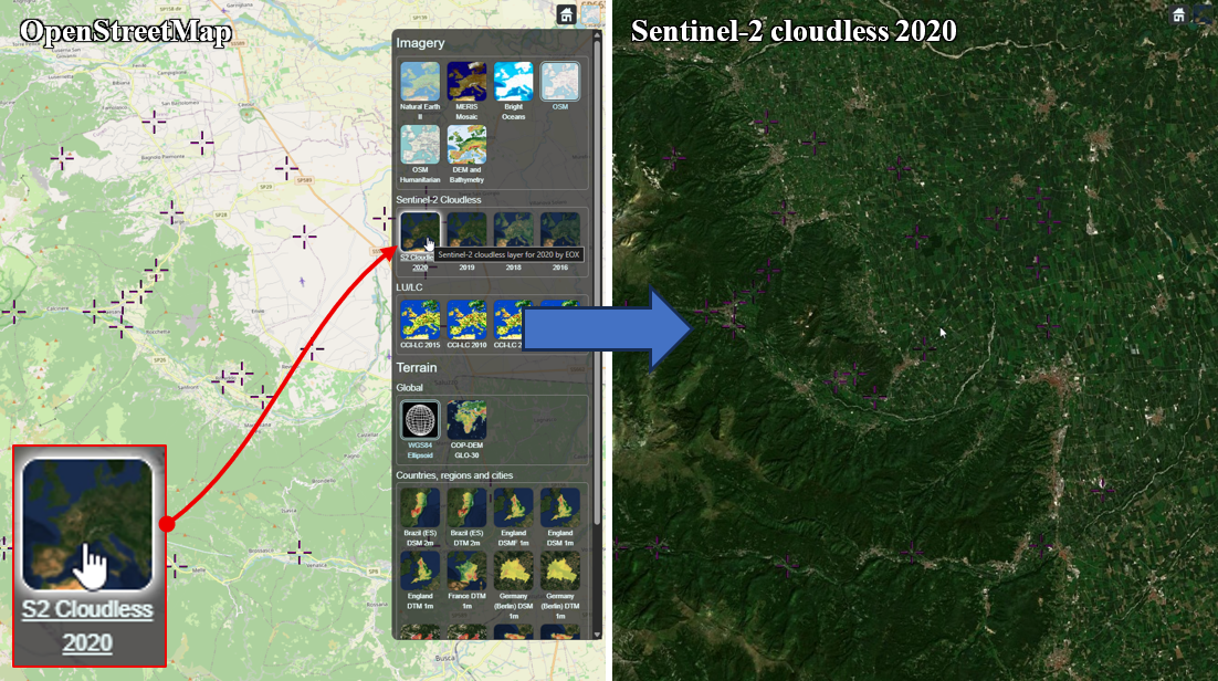
The default base map of the viewer is provided by OpenStreetMap. As illustrated in figure above, other layers are available through a dedicated “base map picker”. This picker opened by clicking on the icon located in the top-right of the screen. This example showcases a change of base map from OpenStreetMap to the Sentinel-2 cloudless 2020 layer.
DEM picker
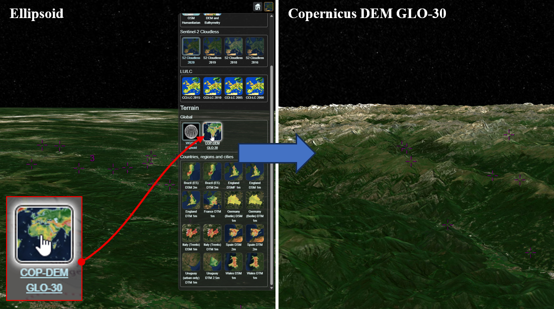
Similarly to base maps, it is also possible to pick a DEM to be displayed in the 3D scene. As illustrated in figure above, the DEM can be selected in the same panel as base maps. This example showcases a change of elevations source, from ellipsoid (no DEM, default) to Copernicus DEM GLO-30 (global DEM at 1” arcsecond).
Main panel
This section provides the functionalities of the main panel (see platform overview). Each one of the following subsections focuses on one function of this panel.
“Fold” button
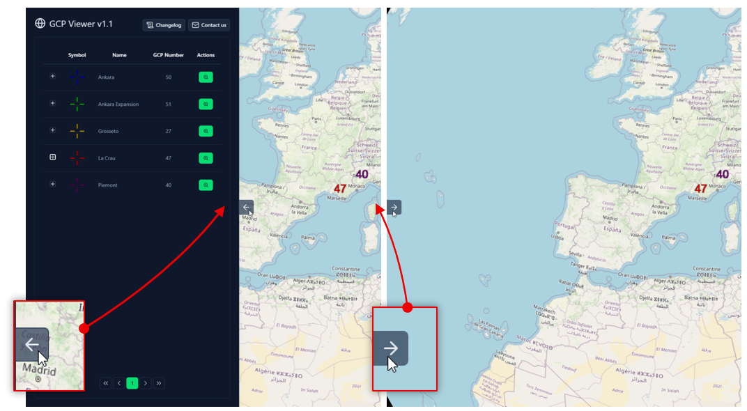
The main panel of the platform can be shown or hidden by user preference. As seen in figure above, the left panel can be hidden using the "left arrow" button (right of the panel), or expanded using the "right arrow" button (left of the screen).
“Changelog” button
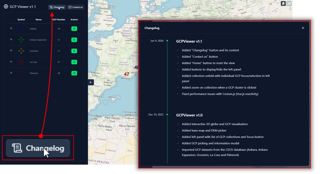
The changelog allows to see the new functionalities and improvements of each version. As illustrated in figure above, the changelog can be accessed by clicking on the “Changelog” button on the top of the main panel.
“Contact us” button
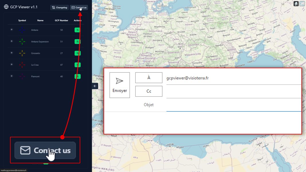
Any question or suggestion can be sent to gcpviewer@visioterra.fr. As illustrated in fig. 11, the “Contact us” button allows to send an email to this address directly.
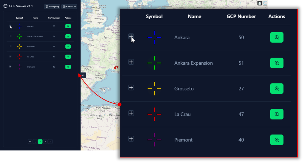
GCP collections table
Each GCP collection is listed in a dedicated table. As illustrated in figure above, each line corresponds to one collection, with a dedicated unfold button (listing each GCP individually), symbol, name, GCP number and possible actions. The following figure illustrates the “zoom on collection” action.
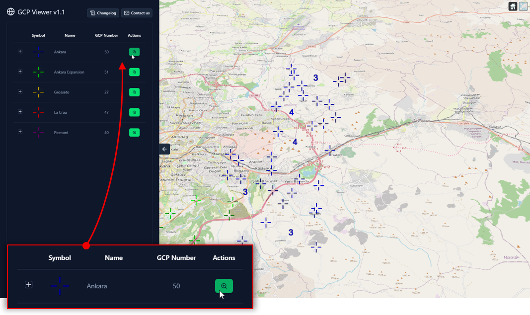
As illustrated in figure above, the lens icon allows to zoom on a specific collection. The view of the globe (right) is automatically adjusted to zoom on the GCPs of the selected collection. The next figure illustrates the zoom on a single GCP.
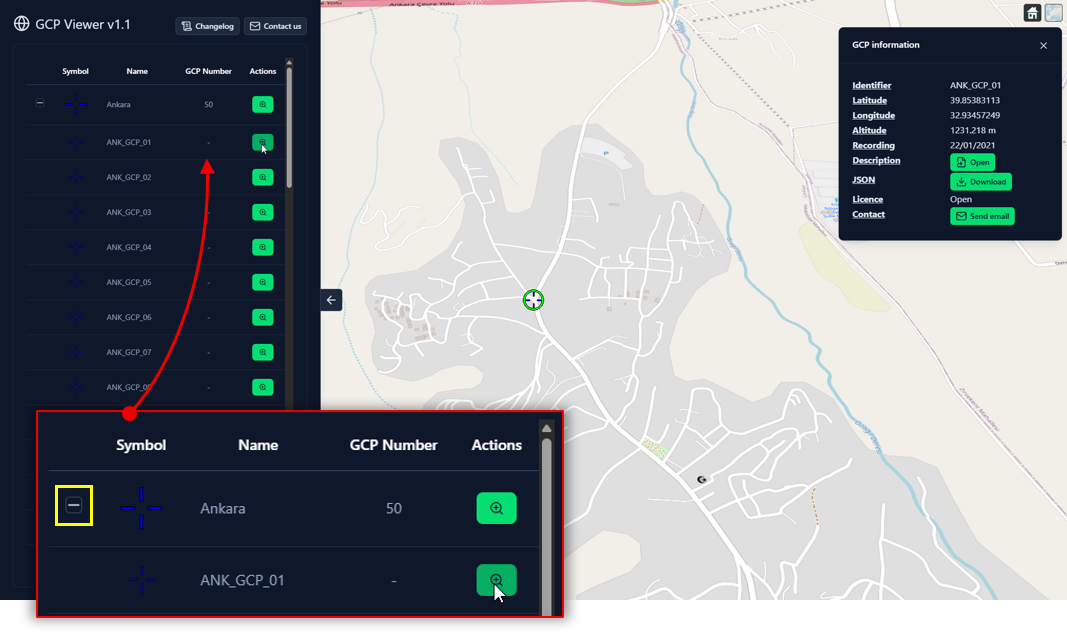
As seen in figure above, GCP collections can be folded/unfolded by clicking on the “+” or “-” icon (yellow rectangle). Once a collection is unfolded, a list of its GCPs is displayed. Each GCP line includes a lens button, allowing to zoom and select a GCP of interest. Information about the selected GCP is given in a small window (see GCP information).